Currently, I am Lead Visual Designer at Pilot Lab in Seattle, Washington.
I am always excited to meet new people and creatives so please don't hesitate to reach out.
Select Clientele
Gates Foundation (Pilot)
Microsoft Office (Pilot)
Hilton Hotels (Pilot)
Big Slide Records
Doo Doo Brand
Fionnuala O'Sullivan Real Estate
Clio Dill Design (CDD)
'MOOD FOOD'
During my own experience and research, I found that eating nutritionally-dense meals has a huge impact on mental health. All recipes & photos are by CDD.
'MOOD FOOD'
During my own experience and research, I found that eating nutritionally-dense meals has a huge impact on mental health. All recipes & photos are by CDD.
MIND / BODY / HEART
0.4 is divided into three main sections -- mind, body, and heart -- each of which are color-coded according to color psychology. Articles are written for a broad audience in a light tone, yet maintain the evidence-based approach of 0.4 by linking back to scientific studies.
My friends are my biggest inspiration.
Also, I believe design is a tool that can
change the world.
In my practice, I combine photography, writing, research, and data to inform my work. I believe that content is king and form should follow function.
I've been lucky enough to work with people I am truly inspired by and who I believe are game-changers in whatever industry/field they are a part of whether that's philanthropy, fashion, music, or food & dining.
Nothing makes me more excited than helping the people I admire transform their dreams into a realities. It's pretty rad.
MIND / BODY / HEART
0.4 is divided into three main sections -- mind, body, and heart -- each of which are color-coded according to color psychology. Articles are written for a broad audience in a light tone, yet maintain the evidence-based approach of 0.4 by linking back to scientific studies.
MIND / BODY / HEART
0.4 is divided into three main sections -- mind, body, and heart -- each of which are color-coded according to color psychology. Articles are written for a broad audience in a light tone, yet maintain the evidence-based approach of 0.4 by linking back to scientific studies.
MIND / BODY / HEART
0.4 is divided into three main sections -- mind, body, and heart -- each of which are color-coded according to color psychology. Articles are written for a broad audience in a light tone, yet maintain the evidence-based approach of 0.4 by linking back to scientific studies.
My friends are my biggest inspiration.
Also, I believe design is a tool that can
change the world.
In my practice, I combine photography, writing, research, and data to inform my work. I believe that content is king and form should follow function.
I've been lucky enough to work with people I am truly inspired by and who I believe are game-changers in whatever industry/field they are a part of whether that's philanthropy, fashion, music, or food & dining.
Nothing makes me more excited than helping the people I admire transform their dreams into a realities. It's pretty rad.
—DDB® FOUNDER, MIA TRACHTENBERG
My friends are my biggest inspiration.
Also, I believe design is a tool that can
change the world.
In my practice, I combine photography, writing, research, and data to inform my work. I believe that content is king and form should follow function.
I've been lucky enough to work with people I am truly inspired by and who I believe are game-changers in whatever industry/field they are a part of whether that's philanthropy, fashion, music, or food & dining.
Nothing makes me more excited than helping the people I admire transform their dreams into a realities. It's pretty rad.


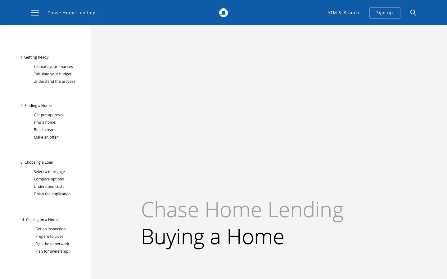
The Ask
Redesign the Chase Home Lending website for two key product pages.
Invision future states for tools and interactions.
Design tasks included:
-
UX and Visual design of the Nav, Tools, and 'Affordability' and 'Homepage'
-
Prototyping different entry points
-
Using internal research and user testing findings to inform the design
-
Competitor research
Role: Designer (UX + Visual)
01
Navigation
Nav explorations
I explored two main ways of approaching the nav. One was to focus on using their current site structure and considering different interaction models and another was changing the Chase's primary nav altogether (the blue bar.)
We also looked at different ways to separate the product pages (Buy, Finance, and Fund/Borrow) and child pages -- exploring combining the two in the left nav or adding a second horizontal nav.
CHANGING SIDE NAV + ADDING SECONDARY NAV


PROTOTYPE EXPLORATIONS:
SECONDARY NAV APPEARS ON SCROLL
Based off future state sitemap. Exploring option of having secondary nav appear on scroll.
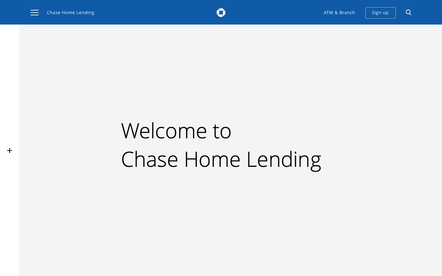
NAV SIDE BAR
Creating a more focused state of the page with hiding the side nav all together.
CHANGING PRIMARY NAV

Nav open

Nav closed

Nav closed
Nav open
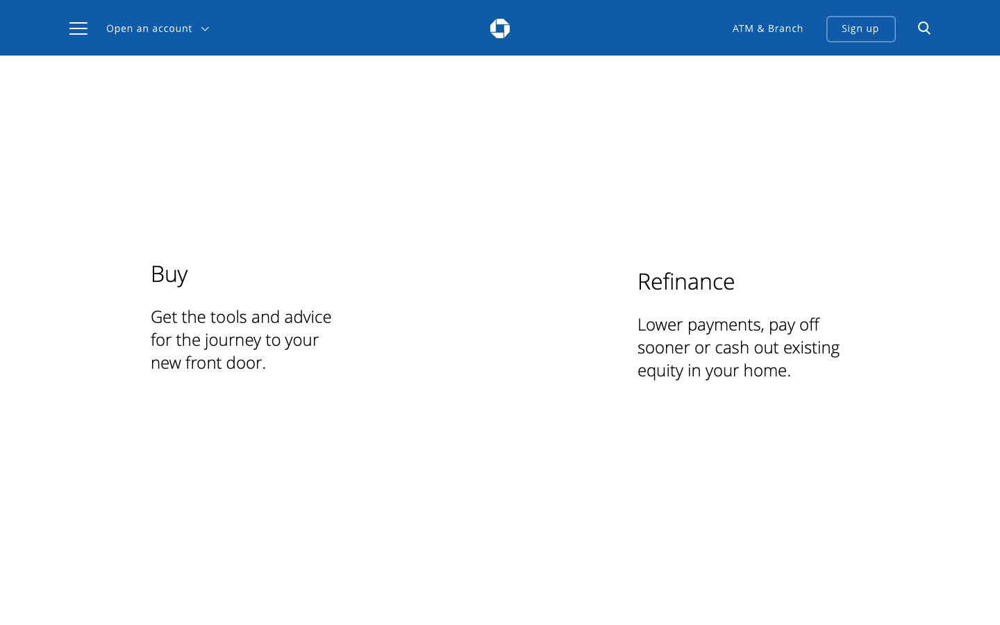
Final Proposal
(final nomenclature TBD)
After the first round of explorations, the client decided they didn't want to touch the primary nav for internal reasons on their end. So, we revisited an initial earlier idea and combined both product and child pages. Additionally, we added 'Home' for the 'Chase Home Landing' page as per their request.
Note: I would not have recommended that as it is confusing to have the 'Home' tab on a 'Home Lending' site called 'Home', but this nomenclature is still up for debate.


02
Child Page
Design Brief
Current vs Future State
Design a 'child page' (we chose the 'Affordability' page because it's the most complex) so the internal Chase team can use it to build modules and design out future pages.
This comp shows the future state of the nav (combining products in secondary top nav for increase visibility) and the addition of the following:
Design changes:
-
Modification of nav
-
Content sweep - based on user research interviews, people felt overwhelmed by the amount of content so I took a pass at condensing the amount of information
-
Got rid of videos because they didn't add value to page
-
Added the 'Affordability Calculator' tool in context (rather than linking out to product page)
-
Clarified the 'Understand the Costs of Ownership Chart' by separating 'When' and 'What' from 'How Much' so people could quickly scan to know when to expect costs
-
Added the module 'Your total cost' (Numbers are FPO) which would leave users knowing with useful numbers to take with them into the next section
-
Added the module at the bottom 'Next section' to encourage people to stay on the site and move them onto the next section
Narrative:
Explain affordability > Show what they can afford > Include other unprecedented costs
CURRENT

PROPOSED

03
Affordability Tool
Goal
Reimagine the future state of the 'Affordability' tool.
Researched what was out on the market and did an audit to find the descrepancies between inputs and outputs.
1. NERD WALLET:


2. CHASE:


3. BETTER:


The Culmination
After numerous iterations of the calculator before and referencing Nerdwallet, we proposed this design.
Main design differences:
-
increasing hierarchy of the housing price and monthly payment
-
changing language to show that the deeper dive of information is a subcategory of the cost ('see change breakdown of all your expenses'
-
show the expenses in a pie chart (vs a bar chart) so that a user can see quickly the relative cost comparison across different expenses
-
color code the expenses based on whether the total housing price is affordable or not

Default state


Default state
Breakdown of expenses:
Breakdown of expenses: looked it at as modal. Color coded based on whether it was deemed affordable or not.

Data entries + Tools in Context
After doing an analysis to see what was missing from the current design of the page, we found that 'Monthly Expenditures' and 'Annual Income' were the only two parts of the puzzle missing in order to compute 'Housing Price' and 'Monthly Payment.' Thus, we proposed to add the inputs in context higher up on the page so by the time you got to the Affordability Calculator, the data was already pre-filled.


04
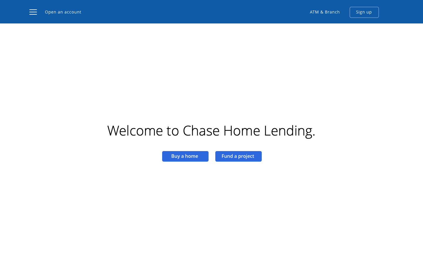
Homepage
Design task:
Redesign the homepage with the following goals:
-
Better direct consumers to the information / products they are searching for
-
Leverage current content
-
Tell 'Why Chase'

Direct users to products immediately.

More copy gives more context to what products are.

Quickest routing to user need
Direct users to products immediately.
Research:
Below are quotes from user interviews with my notes that informed design decisions and explorations.
What I took into design:
-
Users expressed they wanted to know how long each section would take to read so we added in that info at the beginning of each section
-
Because users said this was an unfamiliar process and were keen for guidance, we adopted a more casual tone to help guide users through the process
-
We also translated the steps of buying a house into the nav, so going through the process felt like more linear and gave users satisfaction of learning / completing the process.


BIFURCATION
Choose product immediately.
REASONS TO BELIEVE
Address 'Why Chase'
QUOTE / STAT / ABOUT
Sentence that continues story.
QUOTE FROM ONE OF THEIR VIDEOS
Quote + image
TOOL HIGHLIGHT
Highlight one of their tools.
'LEARN MORE' module
Ways to learn more if you don't know what you want to do.
CONTACT + FIND AN ADVISOR
FOOTER
Motion explorations:
Explorations for the homepage entry.
HOMEPAGE WIREFRAME:
HOMEPAGE FINAL DESIGNS:

