Currently, I am Lead Visual Designer at Pilot Lab in Seattle, Washington.
I am always excited to meet new people and creatives so please don't hesitate to reach out.
Select Clientele
Gates Foundation (Pilot)
Microsoft Office (Pilot)
Hilton Hotels (Pilot)
Big Slide Records
Doo Doo Brand
Fionnuala O'Sullivan Real Estate
Clio Dill Design (CDD)
'MOOD FOOD'
During my own experience and research, I found that eating nutritionally-dense meals has a huge impact on mental health. All recipes & photos are by CDD.
'MOOD FOOD'
During my own experience and research, I found that eating nutritionally-dense meals has a huge impact on mental health. All recipes & photos are by CDD.
MIND / BODY / HEART
0.4 is divided into three main sections -- mind, body, and heart -- each of which are color-coded according to color psychology. Articles are written for a broad audience in a light tone, yet maintain the evidence-based approach of 0.4 by linking back to scientific studies.
My friends are my biggest inspiration.
Also, I believe design is a tool that can
change the world.
In my practice, I combine photography, writing, research, and data to inform my work. I believe that content is king and form should follow function.
I've been lucky enough to work with people I am truly inspired by and who I believe are game-changers in whatever industry/field they are a part of whether that's philanthropy, fashion, music, or food & dining.
Nothing makes me more excited than helping the people I admire transform their dreams into a realities. It's pretty rad.
MIND / BODY / HEART
0.4 is divided into three main sections -- mind, body, and heart -- each of which are color-coded according to color psychology. Articles are written for a broad audience in a light tone, yet maintain the evidence-based approach of 0.4 by linking back to scientific studies.
MIND / BODY / HEART
0.4 is divided into three main sections -- mind, body, and heart -- each of which are color-coded according to color psychology. Articles are written for a broad audience in a light tone, yet maintain the evidence-based approach of 0.4 by linking back to scientific studies.
MIND / BODY / HEART
0.4 is divided into three main sections -- mind, body, and heart -- each of which are color-coded according to color psychology. Articles are written for a broad audience in a light tone, yet maintain the evidence-based approach of 0.4 by linking back to scientific studies.
My friends are my biggest inspiration.
Also, I believe design is a tool that can
change the world.
In my practice, I combine photography, writing, research, and data to inform my work. I believe that content is king and form should follow function.
I've been lucky enough to work with people I am truly inspired by and who I believe are game-changers in whatever industry/field they are a part of whether that's philanthropy, fashion, music, or food & dining.
Nothing makes me more excited than helping the people I admire transform their dreams into a realities. It's pretty rad.
—DDB® FOUNDER, MIA TRACHTENBERG
My friends are my biggest inspiration.
Also, I believe design is a tool that can
change the world.
In my practice, I combine photography, writing, research, and data to inform my work. I believe that content is king and form should follow function.
I've been lucky enough to work with people I am truly inspired by and who I believe are game-changers in whatever industry/field they are a part of whether that's philanthropy, fashion, music, or food & dining.
Nothing makes me more excited than helping the people I admire transform their dreams into a realities. It's pretty rad.


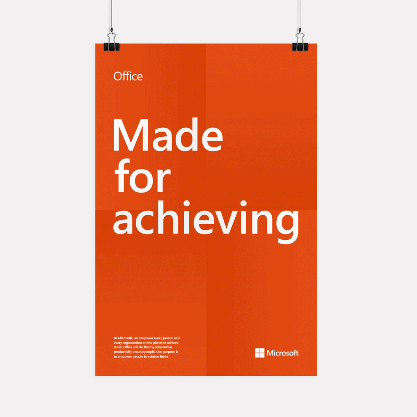
Office
Working with a small team at Pilot Lab, I helped design the rebrand for Microsoft Office. The concept was centered around celebrating all acts of achieving that are accomplished using Office tools, from a student writing a paper to an author publishing a book.
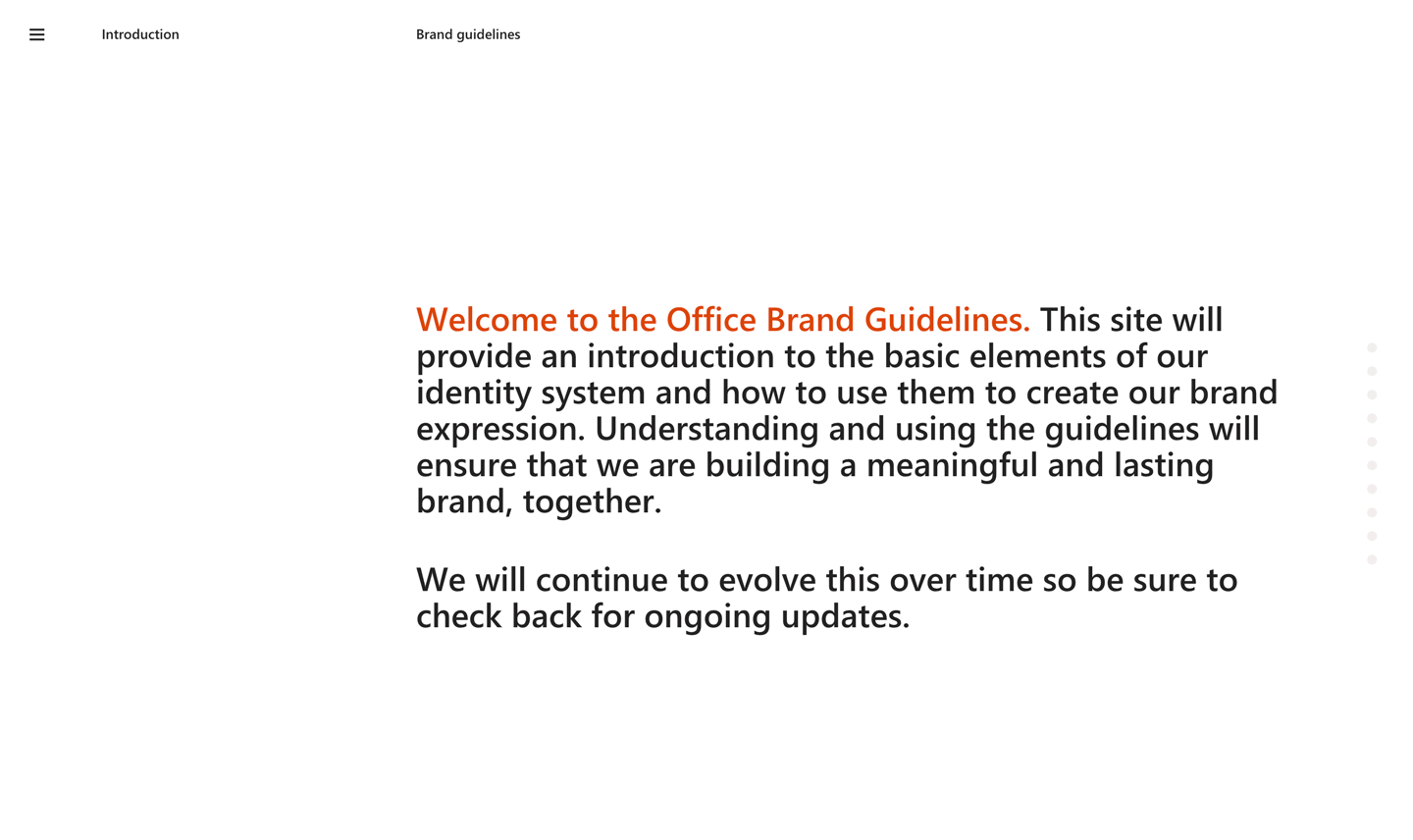
We delivered a splash page that showcased the new brand, an online website outlining the brand guidelines, and a variety of print material that embodied the new Office.
Visual Design
Research
User Experience Design
Responsive Web Design
Visual Design
Environment Design
Office Brand Principles
The Office principles are optimistic, dynamic, authentic, and forward-thinking. Office provides the foundation on which people from all walks of life work, communicate, create, and collaborate to get things done and do great things together.
Office provides the foundation on which people from all walks of life work, communicate, create, and collaborate to get things done and do great things together.

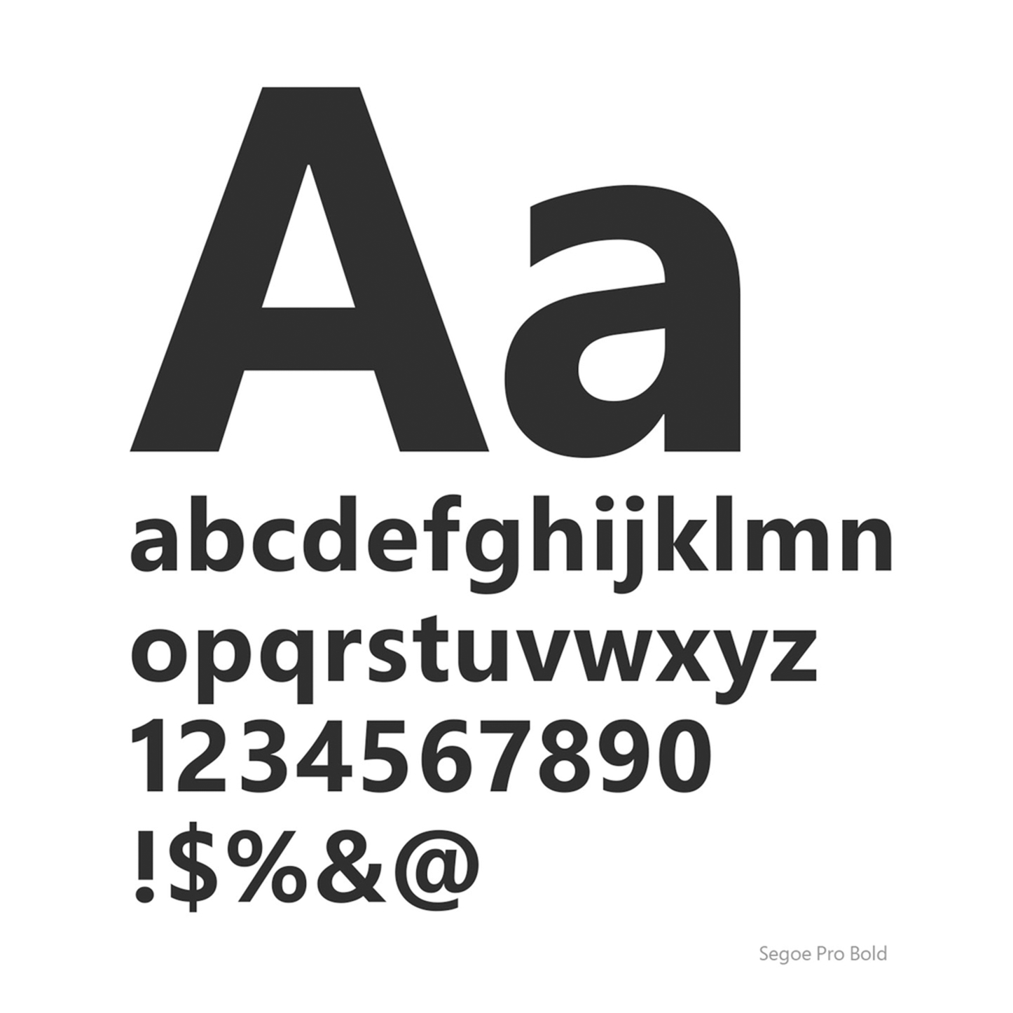
Brand Elements: Typography
The Microsoft brand typeface, Segoe, expresses the Office nature—clean, human, and versatile—visually.
Segoe is an essential and long-standing element of our brand identity. It can be used across a number of languages, including English, European languages, Greek, Hebrew, Armenian, Georgian, and Arabic.
Visual Metaphors
We designed a number of visual metaphors intended to communicate the core aspects of the new brand.These included:
- collaboration
- intelligence
- trust
- & mobility.
One Brand: Three Worlds
The Office brand is made up of a set of core elements. They can be combined in various ways to tailor the brand expression to speak to our different audiences. It can be tuned to be more expressive for consumers and more conservative for the enterprise audience.
