 |
|---|
|
|---|
|
|---|
Currently, I am Lead Visual Designer at Pilot Lab in Seattle, Washington.
I am always excited to meet new people and creatives so please don't hesitate to reach out.
Select Clientele
Gates Foundation (Pilot)
Microsoft Office (Pilot)
Hilton Hotels (Pilot)
Big Slide Records
Doo Doo Brand
Fionnuala O'Sullivan Real Estate
Clio Dill Design (CDD)
'MOOD FOOD'
During my own experience and research, I found that eating nutritionally-dense meals has a huge impact on mental health. All recipes & photos are by CDD.
'MOOD FOOD'
During my own experience and research, I found that eating nutritionally-dense meals has a huge impact on mental health. All recipes & photos are by CDD.
MIND / BODY / HEART
0.4 is divided into three main sections -- mind, body, and heart -- each of which are color-coded according to color psychology. Articles are written for a broad audience in a light tone, yet maintain the evidence-based approach of 0.4 by linking back to scientific studies.
My friends are my biggest inspiration.
Also, I believe design is a tool that can
change the world.
In my practice, I combine photography, writing, research, and data to inform my work. I believe that content is king and form should follow function.
I've been lucky enough to work with people I am truly inspired by and who I believe are game-changers in whatever industry/field they are a part of whether that's philanthropy, fashion, music, or food & dining.
Nothing makes me more excited than helping the people I admire transform their dreams into a realities. It's pretty rad.
MIND / BODY / HEART
0.4 is divided into three main sections -- mind, body, and heart -- each of which are color-coded according to color psychology. Articles are written for a broad audience in a light tone, yet maintain the evidence-based approach of 0.4 by linking back to scientific studies.
MIND / BODY / HEART
0.4 is divided into three main sections -- mind, body, and heart -- each of which are color-coded according to color psychology. Articles are written for a broad audience in a light tone, yet maintain the evidence-based approach of 0.4 by linking back to scientific studies.
MIND / BODY / HEART
0.4 is divided into three main sections -- mind, body, and heart -- each of which are color-coded according to color psychology. Articles are written for a broad audience in a light tone, yet maintain the evidence-based approach of 0.4 by linking back to scientific studies.
My friends are my biggest inspiration.
Also, I believe design is a tool that can
change the world.
In my practice, I combine photography, writing, research, and data to inform my work. I believe that content is king and form should follow function.
I've been lucky enough to work with people I am truly inspired by and who I believe are game-changers in whatever industry/field they are a part of whether that's philanthropy, fashion, music, or food & dining.
Nothing makes me more excited than helping the people I admire transform their dreams into a realities. It's pretty rad.
—DDB® FOUNDER, MIA TRACHTENBERG
My friends are my biggest inspiration.
Also, I believe design is a tool that can
change the world.
In my practice, I combine photography, writing, research, and data to inform my work. I believe that content is king and form should follow function.
I've been lucky enough to work with people I am truly inspired by and who I believe are game-changers in whatever industry/field they are a part of whether that's philanthropy, fashion, music, or food & dining.
Nothing makes me more excited than helping the people I admire transform their dreams into a realities. It's pretty rad.


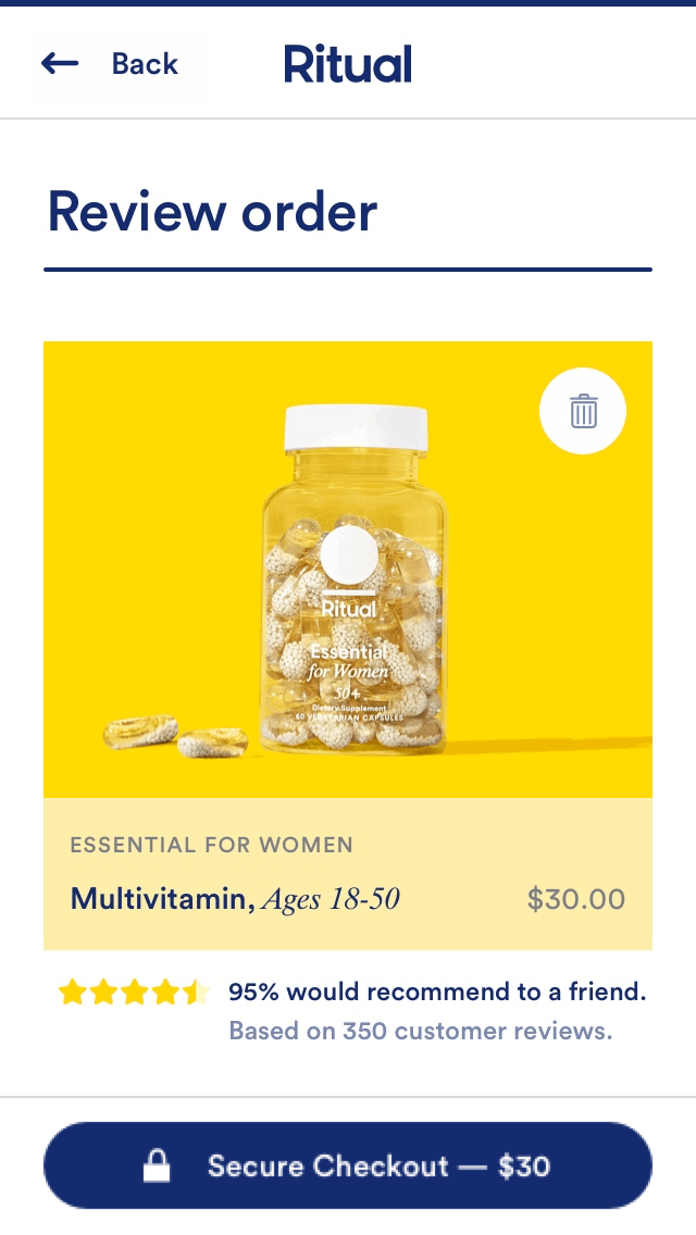
Ritual
My Role: Freelance Product Designer
Design Director: Steph Schiller
Ritual is the reinvented multivitamin that works smarter to fill the gaps in your diet.
Working with Ritual, I helped design their new shopping cart experience. The challenge was to design an elegant, on-brand experience that would scale for future product rollouts as well as take into account limited dev capabilities, such as the technical inability to have multiple subs to the cart.
01
Discovery
Our first step was to conduct competitive research among other e-commerce platforms. We received a list of feature requirements from the Product Manager and then wireframed 'blue-sky' to blow all potential ways to design the cart.
We then consolidated 3 main directions to share with the stakeholders to determine what to user test.
Tools used: Sketch

Direction 1: Vision Board
A vision board is a collage of images, pictures, and affirmations of one's dreams and desires, designed to serve as a source of inspiration and motivation and to use the law of attraction to attain goals.
Pros:
-
Unique and completely custom to Ritual
-
Seamless marketing transition: Make Manifest yourself
-
Embraces extremely visual UX model (Instagram, Pinterest, etc)
-
Influences cross-shopping of categories
Cons:
-
Influences cross-shopping of categories
-
New framework goes against industry standard
-
Potentially more scrolling to checkout
-
Could be confusing and less functional


Direction 2: Category Storytelling
Ritual is part of your basic needs. Leaning into Maslow’s Hierarchy of Needs — aka the base of wellness and physiological needs — the cart is categorically organized.
Pros:
-
Integrates the shopping experience with the experience of using the products
-
Easy to get gain customers — sharing cart with friends
-
Mad Libs allows for learning about customers and personalizing the experience
-
Steps provide a way to chunk content
Cons:
-
New framework goes against industry standard, could be a steep learning curve
-
Could be confusing and less functional


Direction 3: Nuance Support
Ritual is the first company to give customers the opportunity to ship subscriptions to different addresses. Here, we’re leaning into the industry standard shopping cart experience so it’s clear what makes us different.
Pros:
-
Inline with industry-standard – least friction
-
Easily supports bundling and re-bundling
-
We provide visual cues to show the subscription as a 3-part set.
Cons:
-
The experience doesn’t necessarily conceptually tie back to brand ethos
-
Isn’t a unique experience
02
User Testing
After our check-in with stakeholders, we focused our efforts on honing in on two main designs: the traditional and visual, each of which had different nuances such as showing reviews, color and placement of the 'Checkout CTA', and differences in copy.
We tested two prototypes with users and received feedback.


What worked well:
-
Large images
-
95% star rating
-
Expanded barrier busters
-
Basic cart icon
-
Payment method cards
What didn't work well:
-
All were annoyed by multi-product add missing functionality
-
Multi-option empty cart
-
Questions around order process date
Indifferent:
-
Trash icon vs “Remove” link
-
Didn’t call out “Secure Checkout”
-
BBB
03
Production
We implemented changes to our designs and consolidated a final production-ready file to hand off to the engineers.
Tools used: Sketch, Abstract
