Currently, I am Lead Visual Designer at Pilot Lab in Seattle, Washington.
I am always excited to meet new people and creatives so please don't hesitate to reach out.
Select Clientele
Gates Foundation (Pilot)
Microsoft Office (Pilot)
Hilton Hotels (Pilot)
Big Slide Records
Doo Doo Brand
Fionnuala O'Sullivan Real Estate
Clio Dill Design (CDD)
'MOOD FOOD'
During my own experience and research, I found that eating nutritionally-dense meals has a huge impact on mental health. All recipes & photos are by CDD.
'MOOD FOOD'
During my own experience and research, I found that eating nutritionally-dense meals has a huge impact on mental health. All recipes & photos are by CDD.
MIND / BODY / HEART
0.4 is divided into three main sections -- mind, body, and heart -- each of which are color-coded according to color psychology. Articles are written for a broad audience in a light tone, yet maintain the evidence-based approach of 0.4 by linking back to scientific studies.
My friends are my biggest inspiration.
Also, I believe design is a tool that can
change the world.
In my practice, I combine photography, writing, research, and data to inform my work. I believe that content is king and form should follow function.
I've been lucky enough to work with people I am truly inspired by and who I believe are game-changers in whatever industry/field they are a part of whether that's philanthropy, fashion, music, or food & dining.
Nothing makes me more excited than helping the people I admire transform their dreams into a realities. It's pretty rad.
MIND / BODY / HEART
0.4 is divided into three main sections -- mind, body, and heart -- each of which are color-coded according to color psychology. Articles are written for a broad audience in a light tone, yet maintain the evidence-based approach of 0.4 by linking back to scientific studies.
MIND / BODY / HEART
0.4 is divided into three main sections -- mind, body, and heart -- each of which are color-coded according to color psychology. Articles are written for a broad audience in a light tone, yet maintain the evidence-based approach of 0.4 by linking back to scientific studies.
MIND / BODY / HEART
0.4 is divided into three main sections -- mind, body, and heart -- each of which are color-coded according to color psychology. Articles are written for a broad audience in a light tone, yet maintain the evidence-based approach of 0.4 by linking back to scientific studies.
My friends are my biggest inspiration.
Also, I believe design is a tool that can
change the world.
In my practice, I combine photography, writing, research, and data to inform my work. I believe that content is king and form should follow function.
I've been lucky enough to work with people I am truly inspired by and who I believe are game-changers in whatever industry/field they are a part of whether that's philanthropy, fashion, music, or food & dining.
Nothing makes me more excited than helping the people I admire transform their dreams into a realities. It's pretty rad.
—DDB® FOUNDER, MIA TRACHTENBERG
My friends are my biggest inspiration.
Also, I believe design is a tool that can
change the world.
In my practice, I combine photography, writing, research, and data to inform my work. I believe that content is king and form should follow function.
I've been lucky enough to work with people I am truly inspired by and who I believe are game-changers in whatever industry/field they are a part of whether that's philanthropy, fashion, music, or food & dining.
Nothing makes me more excited than helping the people I admire transform their dreams into a realities. It's pretty rad.


Gates Foundation
Reflect on the Year:
Gates Foundation 2017
Role: Lead Designer (UX + Visual) at Pilot Lab


Challenge
Share what the Gates Foundation accomplished in 2017 with an interactive model, which provides both a quick read and the opportunity for a deeper dive.
The Gates Foundation has traditionally celebrated their end of year progress with a letter from Bill and Melinda Gates, which from 1998 to 2012 was in the form of a downloadable PDF. For 2017, we designed an interactive experience for readers in the form of a microsite.
After exploring a range of UX models, we decided an accordion-like model functioned best for our intention: to give readers a high-level view of the information with the option of digging deeper by clicking on each blade.
My role:
— UX design and research
— Art direction
— Web Design
— Content Strategy
Understanding
Research, Organizational Themes, & Early Thinking
Research included:
— past Year in Review websites
— interaction models
Organizational themes I explored around ways we could curate content:
— data-centric
— time-based
— geography-based
— story-based


Working closely with the Lead Copywriter, I helped shape the Content Strategy and organize the site structure. The Foundation sent over a spreadsheet of potential content to use.
In order to fully understand how we could organize the information and tell the most compelling story, I read all the articles shared with us. It's my belief that content should inform structure and form follows function and without fully understanding the content, a designer is working in the dark.
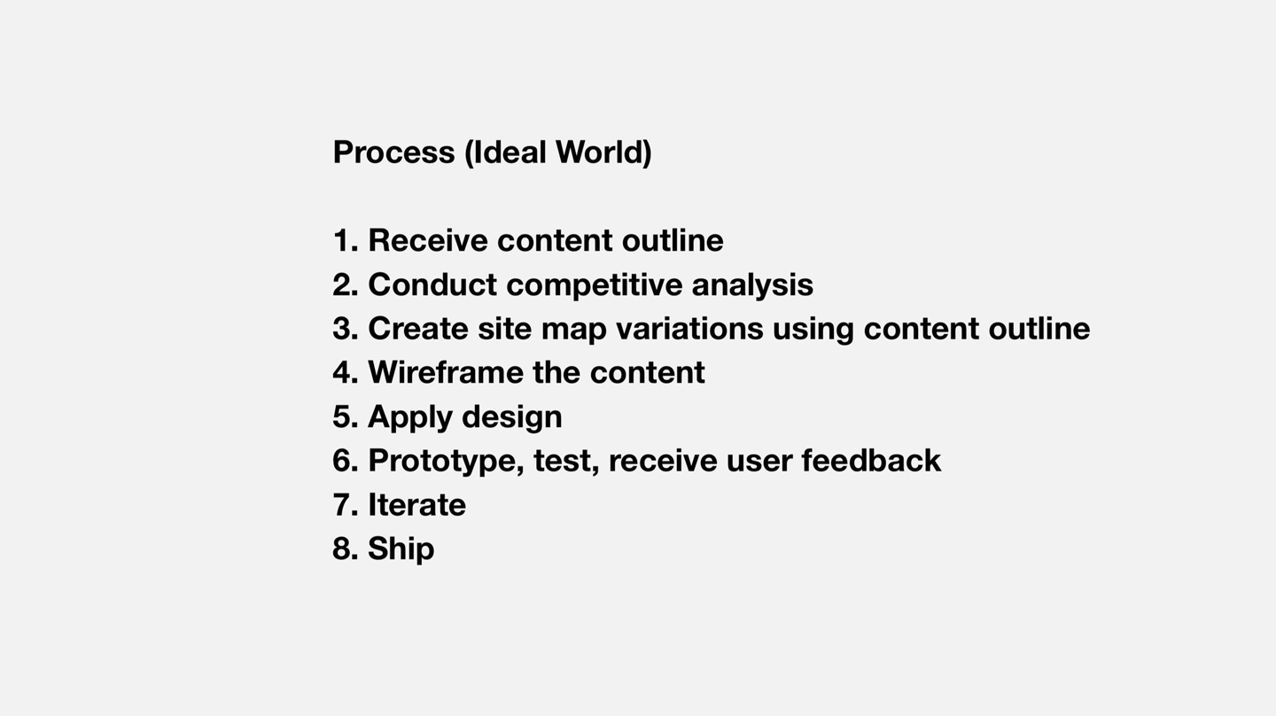
1 Research + Iteration
Art direction: 3 approaches
We proposed three different approaches for the Year in Review, each rooted in a different concept.
Directions:
— A: Color-coded by theme (Ex: polio vaccination is green, women's health is red, etc)
— B: Elevating the human aspect (warmer hues, more photo-forward)
— C: Content-forward (type plays a more prominent role as we focus on words and graphics being the predominant way to tell the stories, rely more on the Gates Foundation archive of imagery)
The client opted for Direction C with a pop of color.
Initial Moodboards


We paired the three different Art Direction concepts with different UX models:
Direction 1: Accordion / Blades
— a quick read (sections on the horizontal axis)
— opportunity to dig deeper (on the vertical axis)
— each story is a discrete section
Direction 2: Zoom
— a single page overview
— more breadth at top
— expandable / scalable over time
Direction 3: Storyline
— linear / horizontal path
— uses common vertical gesture to move
— cinematic, option for voice over
The client opted for Direction 1.

2 Process
Working closely with the developers and client to bring the product to life
I worked extremely closely with the Dev team to bring the concept to life -- spending time in conference rooms, we pushed pixels around together and found creative ways to solve problems together.
Because a lot of the content came in at the end of the project or changed throughout the process, it was constantly a reshuffling of cards.
I implemented a system to work with the client to receive real-time feedback, as we were working within an extremely tight timeframe.
Systems used:
— Trello (to track progress with Dev)
— InVision (to share updates with client and receive feedback)
— Sketch Symbols Library (to make designs consistent across the board)
Slideshow of the Process


Color-Coded Sections
Before & After Photography


3 Final Product
The final product
The final product was received extremely well by the client and its success was due to the teamwork between the Foundation and us. It was also a massive learning process and some takeaways included:
Learnings:
— Content is needed earlier
— Next time, we should have a more flexible framework to slot content in
— Start conversations with all stakeholders involved earlier on (we had to swap assets and that impacted the design)
— Involve dev earlier on
