 |
|---|
|
|---|
|
|---|
Currently, I am Lead Visual Designer at Pilot Lab in Seattle, Washington.
I am always excited to meet new people and creatives so please don't hesitate to reach out.
Select Clientele
Gates Foundation (Pilot)
Microsoft Office (Pilot)
Hilton Hotels (Pilot)
Big Slide Records
Doo Doo Brand
Fionnuala O'Sullivan Real Estate
Clio Dill Design (CDD)
'MOOD FOOD'
During my own experience and research, I found that eating nutritionally-dense meals has a huge impact on mental health. All recipes & photos are by CDD.
'MOOD FOOD'
During my own experience and research, I found that eating nutritionally-dense meals has a huge impact on mental health. All recipes & photos are by CDD.
MIND / BODY / HEART
0.4 is divided into three main sections -- mind, body, and heart -- each of which are color-coded according to color psychology. Articles are written for a broad audience in a light tone, yet maintain the evidence-based approach of 0.4 by linking back to scientific studies.
My friends are my biggest inspiration.
Also, I believe design is a tool that can
change the world.
In my practice, I combine photography, writing, research, and data to inform my work. I believe that content is king and form should follow function.
I've been lucky enough to work with people I am truly inspired by and who I believe are game-changers in whatever industry/field they are a part of whether that's philanthropy, fashion, music, or food & dining.
Nothing makes me more excited than helping the people I admire transform their dreams into a realities. It's pretty rad.
MIND / BODY / HEART
0.4 is divided into three main sections -- mind, body, and heart -- each of which are color-coded according to color psychology. Articles are written for a broad audience in a light tone, yet maintain the evidence-based approach of 0.4 by linking back to scientific studies.
MIND / BODY / HEART
0.4 is divided into three main sections -- mind, body, and heart -- each of which are color-coded according to color psychology. Articles are written for a broad audience in a light tone, yet maintain the evidence-based approach of 0.4 by linking back to scientific studies.
MIND / BODY / HEART
0.4 is divided into three main sections -- mind, body, and heart -- each of which are color-coded according to color psychology. Articles are written for a broad audience in a light tone, yet maintain the evidence-based approach of 0.4 by linking back to scientific studies.
My friends are my biggest inspiration.
Also, I believe design is a tool that can
change the world.
In my practice, I combine photography, writing, research, and data to inform my work. I believe that content is king and form should follow function.
I've been lucky enough to work with people I am truly inspired by and who I believe are game-changers in whatever industry/field they are a part of whether that's philanthropy, fashion, music, or food & dining.
Nothing makes me more excited than helping the people I admire transform their dreams into a realities. It's pretty rad.
—DDB® FOUNDER, MIA TRACHTENBERG
My friends are my biggest inspiration.
Also, I believe design is a tool that can
change the world.
In my practice, I combine photography, writing, research, and data to inform my work. I believe that content is king and form should follow function.
I've been lucky enough to work with people I am truly inspired by and who I believe are game-changers in whatever industry/field they are a part of whether that's philanthropy, fashion, music, or food & dining.
Nothing makes me more excited than helping the people I admire transform their dreams into a realities. It's pretty rad.


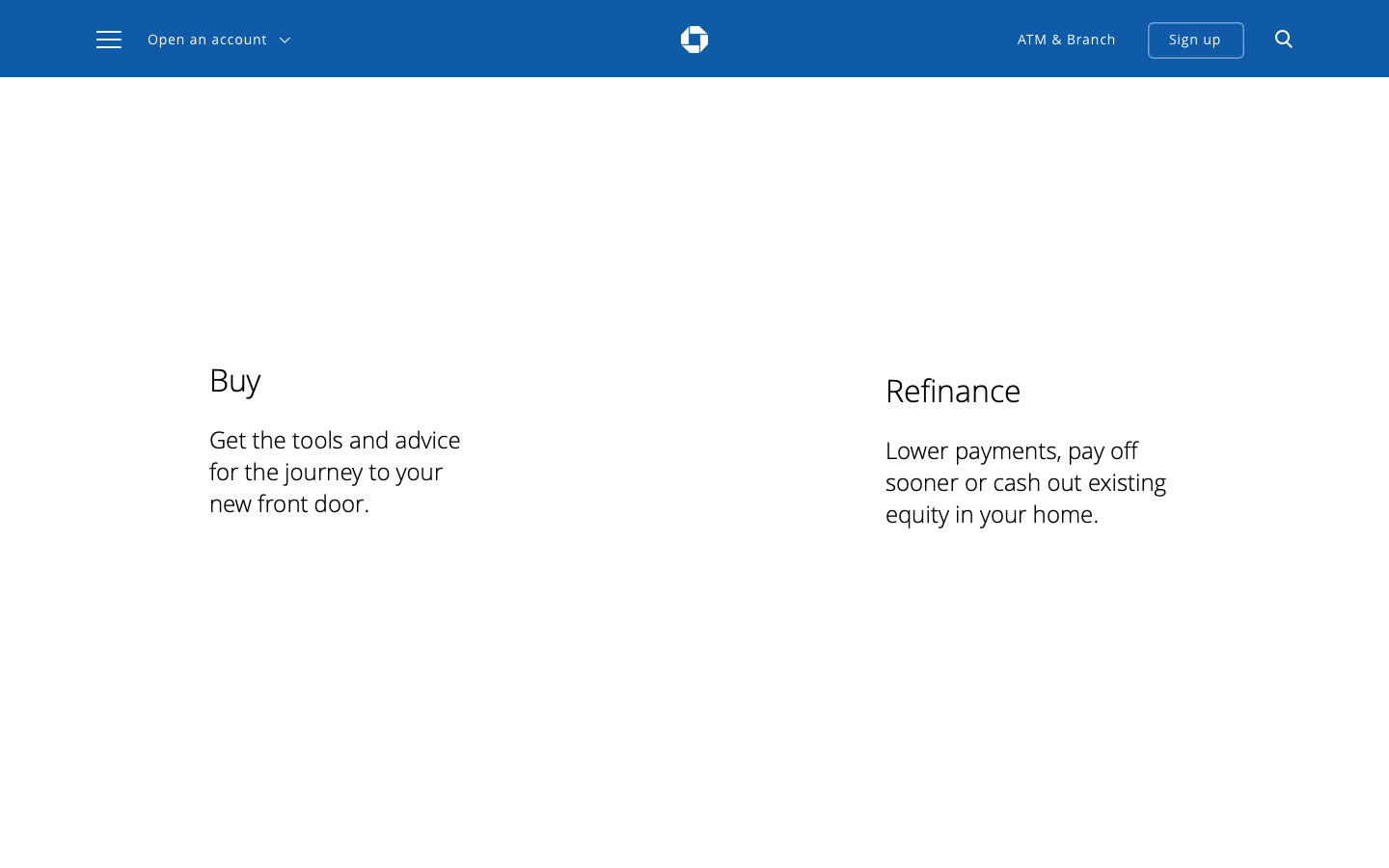
Chase Home Lending
Helping New Homebuyers
Calculate Affordability
Role: Designer (UX + Visual)

Challenge
Educate new homebuyers by elevating content and redesigning tools on the Chase Home Lending site
Chase Home Lending has the content, tools, and resources to help new home buyers make homebuying decisions but their platform was suffering from declining engagement and the current design left users feeling overwhelmed and confused.
Working within a small team at HUGE, I was tasked to design the product vision.
User Research
Understanding user needs and exploring through interviews, research, and data
Out of the 60 million customers Chase customers, 30 million of them have mortgages but only 5 million people have mortgages with Chase. That's only 8%.
Our persona, Kate, was the agreed upon target customer because she was Chase customer and first time homebuyer but did not have a Chase mortgage.


User research allowed us to narrow in on a few key themes for product exploration.
-
How might we make the CHL more customer-oriented?
The current site focused more on 'product offerings' rather than how Chase's services could help the customer.
-
How might we make the site easier to navigate?
Customers were overwhelmed and confused by the site architecture.
-
How might we empower users with educational content and tools?
In order to better serve customer needs, we needed to surface helpful tools like the Mortgage Learning Center, tools and calculators and place them in context with related content.
Redesigning the Affordability Calculator
Market Research: Redesigning the Affordability Calculator

One of the biggest pain points for users was not understanding all the costs involved in buying a home -- which is more than just the mortgage. Chase's Affordability Calculator aimed to assist homebuyers in determining their budget but there were opportunities to improve the tool.
I did a competitor analysis to thoroughly understand the inputs and outputs of calculators across the board to understand the gaps and opportunities to consolidate and improve the tool.
One of the biggest insights we gleaned from the research was that customers were frustrated to find that there were many costs involved in the home buying process, in addition to the mortgage itself.
In order to make additional costs more transparent, I proposed making the summary of costs an interactive calculator so that customers could fill out their expenses and stay informed throughout the process.
User research allowed us to narrow in on a few key themes for product exploration.
-
To discuss what tools were assisting with the process
-
To understand what information was missing
-
To understand how the navigation and site architecture could provide clarity


Bifrication of Steps
Bifrication of Steps
Data visualizations helped users understand the allocation of their money, depending on the cost of a house they were looking at. Color cues also helped translate the experience, making it clear where the costs went above their budget.
High-fidelity wireframes brought the product strategy to life