 |
|---|
|
|---|
|
|---|
Currently, I am Lead Visual Designer at Pilot Lab in Seattle, Washington.
I am always excited to meet new people and creatives so please don't hesitate to reach out.
Select Clientele
Gates Foundation (Pilot)
Microsoft Office (Pilot)
Hilton Hotels (Pilot)
Big Slide Records
Doo Doo Brand
Fionnuala O'Sullivan Real Estate
Clio Dill Design (CDD)
'MOOD FOOD'
During my own experience and research, I found that eating nutritionally-dense meals has a huge impact on mental health. All recipes & photos are by CDD.
'MOOD FOOD'
During my own experience and research, I found that eating nutritionally-dense meals has a huge impact on mental health. All recipes & photos are by CDD.
MIND / BODY / HEART
0.4 is divided into three main sections -- mind, body, and heart -- each of which are color-coded according to color psychology. Articles are written for a broad audience in a light tone, yet maintain the evidence-based approach of 0.4 by linking back to scientific studies.
My friends are my biggest inspiration.
Also, I believe design is a tool that can
change the world.
In my practice, I combine photography, writing, research, and data to inform my work. I believe that content is king and form should follow function.
I've been lucky enough to work with people I am truly inspired by and who I believe are game-changers in whatever industry/field they are a part of whether that's philanthropy, fashion, music, or food & dining.
Nothing makes me more excited than helping the people I admire transform their dreams into a realities. It's pretty rad.
MIND / BODY / HEART
0.4 is divided into three main sections -- mind, body, and heart -- each of which are color-coded according to color psychology. Articles are written for a broad audience in a light tone, yet maintain the evidence-based approach of 0.4 by linking back to scientific studies.
MIND / BODY / HEART
0.4 is divided into three main sections -- mind, body, and heart -- each of which are color-coded according to color psychology. Articles are written for a broad audience in a light tone, yet maintain the evidence-based approach of 0.4 by linking back to scientific studies.
MIND / BODY / HEART
0.4 is divided into three main sections -- mind, body, and heart -- each of which are color-coded according to color psychology. Articles are written for a broad audience in a light tone, yet maintain the evidence-based approach of 0.4 by linking back to scientific studies.
My friends are my biggest inspiration.
Also, I believe design is a tool that can
change the world.
In my practice, I combine photography, writing, research, and data to inform my work. I believe that content is king and form should follow function.
I've been lucky enough to work with people I am truly inspired by and who I believe are game-changers in whatever industry/field they are a part of whether that's philanthropy, fashion, music, or food & dining.
Nothing makes me more excited than helping the people I admire transform their dreams into a realities. It's pretty rad.
—DDB® FOUNDER, MIA TRACHTENBERG
My friends are my biggest inspiration.
Also, I believe design is a tool that can
change the world.
In my practice, I combine photography, writing, research, and data to inform my work. I believe that content is king and form should follow function.
I've been lucky enough to work with people I am truly inspired by and who I believe are game-changers in whatever industry/field they are a part of whether that's philanthropy, fashion, music, or food & dining.
Nothing makes me more excited than helping the people I admire transform their dreams into a realities. It's pretty rad.


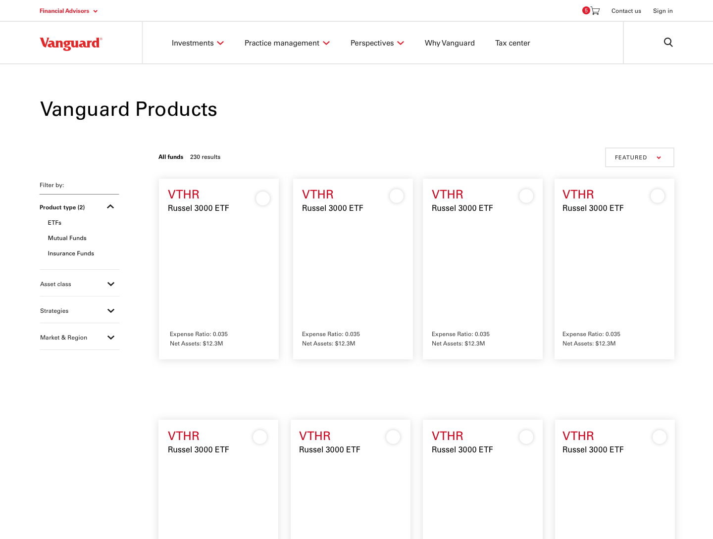
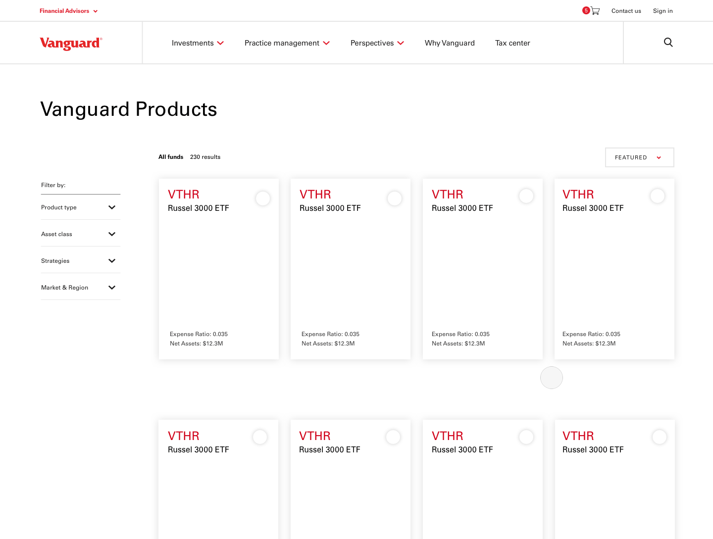
Overview
Vanguard's Financial Advisor Portal provides advisors a new way to shop for investments for their clients.
As part of a larger scope of work including a rehaul of Vanguard's brand and website, we redesigned the Financial Advisor Services portal. FAS is where advisors come to shop for investment products for their clients.
Working within a small team at HUGE, I was tasked to propose a new UX for the Investment Page showcasing investment offerings, using Vanguard's updated style guide.
User Research
Understanding what advisors are looking for when they're shopping for products
We interviewed Financial Advisors at Vanguard and screen-recorded them interacting with the Investments Product page across a number of different competitor sites to understand better the kind of information they looked for.
We looked at competitors, including Blackrock and Pimco, and asked advisors what content was most important and how different ways of organizing and presenting information improved or inhibited the quality of their search.

User research allowed us to narrow in on a few key themes for product exploration.
-
How might we make the Investment page more digestible and create a better sense of hierarchy?
The current site had no sense of hierarchy and all information is displayed at the same level.
-
How might we use other ways of searching to inform the way we design the site?
By looking at different sites outside the financial realm that empower users to search content in other ways, we were able to provide fresh recommendations to the client and advisors. (For example we looked at e-commerce websites like Urban Outfitters, inspiration sites like Behance, and others non-financial sites to get inspired by other ways of searching.)
-
How might we expedite the shopping process?
In order to accelerate the search process, I explored different ways of organizing and presenting the information to make it more scannable and quickly help advisors find what they were looking for. This included changing the data into data vis and incorporating a sidebar filter to quickly narrow in on specific products.
Market Research
E-Commerce: Shopping for Investments vs Browsing
Looking at sites outside the financial realm allowed me to bring fresh design perspectives to the table. I argued that essentially what financial advisors were doing was shopping — so why not make that process more scannable, visual, and familiar.
All Investments: Before

All Investments: After

"Clio brought fresh UX ideas to the table that we hadn't even considered."
— Alex Bluman, Client Engagement Director

Final Product
Embracing Industry Standard
Because we were working with a tight timeframe, we weren't able to do user testing so we decided to stick with the industry-standard design but make content changes based on what financial advisors had expressed was helpful information to see. (This info was gathered during initial calls with them at the beginning of the project.)
Main changes included:
- adding a tab for 'Performance' and 'Yield' to decrease information overload
- adding the number of results shown
- re-jigging the prioritization so that the investments displayed reflected their relative importance (i.e. Kind of Investment, Strategy Class, and then Asset Class)

